Information Architecture Meets User Expectations
Through extensive card sorting and tree testing sessions I redesigned Redken’s international sites to match how hair professionals think.
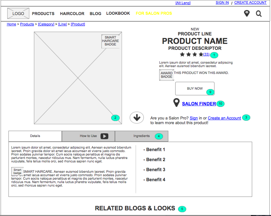
Product Details Page, Redken


My Role
I was the project’s User Experience Designer, charged with conducting user research, constructing the sitemap, assisting in user story creation, and designing annotated wireframes.
Objective
My team was tasked with redesigning a responsive, global website for a luxury haircare brand. The site was not to have E-commerce capabilities at launch, but to easily allow for E-commerce capabilities to be implemented down the line. The site needed to be template-driven, so that different country brand teams could maintain the site on their own. Furthermore, the site was to feature “Professional-Only” content in addition to the consumer facing content.
Research
With our user-centered design approach in mind, we first delved into extensive user research and testing. Using Validately’s video user testing platform, I ran user tests on the current U.S. site with both mobile and desktop users to identify pain points and areas of exploration. Then, I conducted card sorting with both consumers and professionals within the haircare industry to understand how they organized products and topics within a haircare ecosystem in order to inform the site’s information architecture. Using all of the information I obtained, along with competitive research from the Account team, I created three user personas. These user personas helped segment user groups and guide us through intensive user story and acceptance criteria workshops.
Solution
Overall, I realized that users of haircare websites wanted to quickly find the products that were right for their haircare needs, but they also wanted to know the ingredients of products, how to obtain trendy looks, and other relevant information to specific products. Because of this, I decided to create a website that was quickly digestible, but that also did not lead the user to any “dead-ends”. I wanted users to be able to access ample information on products as needed, as well as learn how to use that specific product in order to create a variety of looks.
On product list pages, we implemented a filtering system that easily narrowed users down to exactly what they were looking for by being additive within topics (such as Product Type) but deductive across topics. To clarify this functionality to users, we included a “narrative filter phrase” that told users exactly how products were being filtered.
As the site was not going to be E-commerce at launch, I wanted to give users the ability to quickly purchase a product from an outside vendor, without much of a disruption to their experience. I also wanted the product detail pages to be switched over to E-commerce without further designs when the client was ready. With all of this in mind, we designed a CTA button that on hover or tap would list out the different online vendors the user could quickly purchase the product from. This button could easily be switched to an “Add to Bag” CTA once e-commerce capabilities were implemented.
Lastly, the site was to be developed by an outside development firm, though they were not involved with the design process. Because of that, I added highly descriptive annotations throughout my wireframes to match user stories and to contextually outline functionality to the future developers.
